As we mentioned earlier, there are only three people who have attended all six
Chicago worldcons. One is Forry Ackerman and another is the writer of this article
(we'll leave the identity of the third as an exercise for the reader). Dave now
continues his autobiographical series with an article about his different careers as
an artist, writer, and small press publisher, and the links from each to the science
fiction world.
 From time to time I've been a
professional science fiction artist. I'm currently an old-guy, a non-practicing
member of ASFA with my glorious artwork days in the distant past. And what
wonderful exciting days they were, too! I once 'earned a living' as an sf
illustrator sixty years ago when sf magazines were numerous and commonplace. My
friends and a few editors knew me affectionately as 'the poor man's Paul'. From time to time I've been a
professional science fiction artist. I'm currently an old-guy, a non-practicing
member of ASFA with my glorious artwork days in the distant past. And what
wonderful exciting days they were, too! I once 'earned a living' as an sf
illustrator sixty years ago when sf magazines were numerous and commonplace. My
friends and a few editors knew me affectionately as 'the poor man's Paul'.
Frank R. Paul, as any true fan knows,
was for a half century the world's foremost sf artist. He was a giant presence in
all of Gernsback's publications. We were thrilled to have him chosen as the very
first Worldcon Guest of Honor. All of fandom I'm certain to say without
contradiction -- everyone in those early days truly honored him. And he still is.
A Wonder Stories Quarterly magazine, on which for me, the worshiping teenager,
he signed his name with such a distinctive flourish so different from the simple
'PAUL' on his work, now hangs in a frame on my wall. This old-world kindly man,
with his close-cropped grey hair and smiling face, warm and kind to every fan, is a
legend for us old-timers. No wonder that when I started drawing illustrations, it
was Paul who was my inspiration.
Don Wollheim, as an editor, was
instrumental in my career of illustrating. I had frequent illustrations in his
Stirring Science and Cosmic Stories. When my best friend Richard
Wilson (an eventual Nebula Award winner) and I shared a cold water flat (Ravens'
Roost) in Manhattan while barely out of our teens, the five bucks cash I would
receive for pay-on-delivery artwork kept us in potatoes and oatmeal. If it wasn't
for the need for money, I doubt that I would have produced as much as I did, because
in my indolent life I tended to be a lazy youth. Editors Robert A. W. "Doc" Lowndes
(Science Fiction and Future Fiction magazines) and Frederik Pohl
(Astonishing Stories), contemporaries of Dick and me and part of the
precocious group of teenagers who became the Futurians, also used my artwork
regularly. However, for Doc Lowndes I worked more at and became better known as a
detective story writer for his Smashing Detective and other Columbia
Publications after World War II. I started accepting assignments from F. Orlin
Tremaine, who had revitalized Astounding Stories and had started his own
publication, Comet Stories, but circumstances limited such participation.
Next to Paul, I most honor the memory
of Elliott Dold, another extraordinary man of many talents. Paul was always
recognizable with his double-bit drawing-pen shading. Dold's shading also was
distinctive. He loved shadows, and the cheekbones of his heroes always had an
unmistakable flair. When I met him in his declining years he was almost blind, but
warm and friendly and not at all bitter.
In those early expanding days of sf
publications in and around the decade of World War II, a number of fan artists such
as John Giunta and Damon Knight got to do professional work. Dick Wilson's wife,
Leslie Perri, also did drawings, and there were others, as well, whose names at the
moment I can't recall. Most famous of them all, of course, is Hannes Bok. His work
rose in readers' respect to rival the exceptional drawings of Virgil Finlay and
Stephen Lawrence and even Weird Tales cover artist Margaret Brundage. Hannes was a
genuine fan but a loner who never attended the famous Hydra Club social
get-togethers. He lived alone in his small apartment on West 108th Street in
Manhattan, amid simple surroundings. When I knew him best was in the mid `40s, and
he had yet to make any substantial money, and subsisted regularly on basic fare such
as beans. Hannes had male friends and his personal life style was something I
neither knew about nor cared about, but he was one of the nicest fellows I knew.
He had such incredible talent. I wish he could have enjoyed the fame and fortune
from his work which was not really there in his lifetime. His creativity encompassed
practically everything, in art and crafts and writing. Had he lived along enough, I
believe he would have become world famous outside of science fiction.
Hannes once did a large painting for
a book display of the Associated Fantasy Publishers. We were the small, pioneering
book publishers of the late 1940s: Arkham House, Avalon Company, Fantasy Publishing
Company, Inc. (FPCI), Gnome Press, Hadley Publishing Company, New Era Publishing
Company, Prime Press, and Shasta Publishers. The huge oil painting, about five or
six feet long on a masonite panel, was a truly marvelous work of art. Years later,
an attempt to find it by me led to a dead end. Then, last year, NASA retiree Fred
Durant, an Arthur C. Clarke collaborator, sent me a copy of a picture of us
publishers in front of the painting. And then, within months, I learned from him
that an sf art collecting husband and wife team, who have published a book about
their material and have a traveling exhibit (the Frank Collection), actually have
recovered a sizable piece of the painting which had been dismembered.
How did I get to become a sf artist
myself? Like most children, I loved crayons and I was a demon with them. As a
product of my times, I found 'The Great War of 1914-1918' awesome and was fascinated
by great guns and ships and planes, and thus imaginary pictures flowed from my
sticks of color.
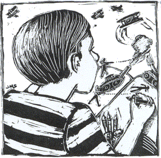 I did have proper restraint, however.
I didn't attack the house walls nor destroy my books. But I consumed reams of paper
and numerous composition books. Battalions of soldiers marched across my pages.
War tanks blazed out fire and projectiles, their spray marked by the inevitable
dotted lines. Submarines appeared here and there. And biplanes filled the skies,
black Maltese crosses and red-white-and-blue cocardes or roundels flashing
everywhere. Obviously I was on my way toward the veneration of mechanical things.
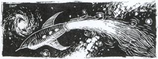
There, in my fascination, was the glimmering of science fiction
gadgetry. But no rocketships -- rocketships would come later.
These were the days when 'science fiction' didn't exist for me, nor, for that matter,
did it exist for anyone. The term wasn't even gestating in the mind of Hugo Gernsback who was just
beginning to create 'scientifiction'.
I did have proper restraint, however.
I didn't attack the house walls nor destroy my books. But I consumed reams of paper
and numerous composition books. Battalions of soldiers marched across my pages.
War tanks blazed out fire and projectiles, their spray marked by the inevitable
dotted lines. Submarines appeared here and there. And biplanes filled the skies,
black Maltese crosses and red-white-and-blue cocardes or roundels flashing
everywhere. Obviously I was on my way toward the veneration of mechanical things.
There, in my fascination, was the glimmering of science fiction
gadgetry. But no rocketships -- rocketships would come later.
These were the days when 'science fiction' didn't exist for me, nor, for that matter,
did it exist for anyone. The term wasn't even gestating in the mind of Hugo Gernsback who was just
beginning to create 'scientifiction'.
Gernsback didn't give me artistic
talent, but he certainly pointed me in that specific direction. First came the
pre-Gersbackian era when The American Boy magazine suggested to me the coming
of science fiction. The futuristic serial "Haunted Airways" and its illustrations
captured my fancy. I'm not certain whether or not the artist was William Heaslip or
the better-known aviation illustrator Clayton Knight. Even more outstanding were
the illustrations for Carl H. Claudy's fantastic stories in that magazine. Such
material helped me evolve into the rabid science fiction fan of the following decade
of the 1930s.
I wrote amateurish sf stories for
classes in high school, illustrating them for my own amusement. And then came the
time to go to Dartmouth, which sadly I couldn't afford. As comic page artist Alex
Raymond and his Flash had nudged me into experimenting with my father's hand
mimeograph machine and thus doing Fantasy World fanzine, my artistic talent
beckoned, offering me an alternative. (Hectograph was plenty of fun with colored
inks and pencils -- but cutting stencils into line drawings was arduous and not very
satisfying.) No college for me. Too bad, but at least there was a trade school --
to attend -- in art, inevitably. Serendipity, however, was at work. That lack of
money has utterly shaped my life because it pushed me on the path directly into
fandom!
In 1936, attracted by a small
advertisement in some respectable publication, I chose the Art Career School in New
York City. The school, with an additional name of Commercial Illustration Studios,
was in the penthouse of the Flatiron Building facing Madison Square, two blocks away
from my 'home' in the McBurney 23rd Street YMCA. (A fantastic coincidence is that
several science fiction book publishers are now housed in the Flatiron Building,
including Tor Books and Tom Doherty Associates.) Across the street from the Y was
an old and faded hotel, The Chelsea, for years Arthur C. Clarke's U.S. hangout.
Active fandom lay before me.
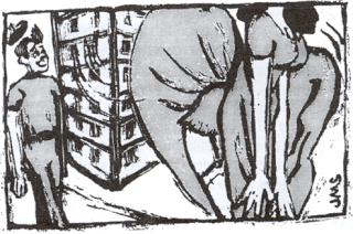 The Flatiron Building in Manhattan,
shaped that way by the crossing of Fifth and Sixth Avenues, is a towering iceberg
still floating in my sea of life. There are many memories around this 'first
skyscraper in the world', half-forgotten, like an iceberg, out of sight below the
surface. A few, however, shine prominently on the top, such as the weekly nude
class mentioned in a previous article {{
ed. note: see "Phamous Phantasy Phan" in Mimosa 24 }}. We young
artists in training were embarrassed at first, then more or less indifferent and
bored, which leads me to a remarkable aspect of human behavior not heretofore
mentioned in my reminiscences. After life class ("You've got the anatomy all wrong
-- go up and take a good look!" -- a comment which greatly amused us young fellows),
we would descend from the penthouse school to street level and head around the prow
of our granite ship. And we would hesitate, titillated by what we frequently saw.
The corner made a natural wind tunnel. The gusts of air struck the pedestrians with
unexpected force, and females, taken unaware, fought back, not all the time
successfully. Their skirts flew up. Their legs were exposed. Sometimes their
knees were bared. Undergarments momentarily flashed into view. We ogled. We
giggled. It was a much much better show than life class. There's a lesson there
about life which I have never forgotten. Today's culture has destroyed old-fashion
thrills. And I very much regret it.
The Flatiron Building in Manhattan,
shaped that way by the crossing of Fifth and Sixth Avenues, is a towering iceberg
still floating in my sea of life. There are many memories around this 'first
skyscraper in the world', half-forgotten, like an iceberg, out of sight below the
surface. A few, however, shine prominently on the top, such as the weekly nude
class mentioned in a previous article {{
ed. note: see "Phamous Phantasy Phan" in Mimosa 24 }}. We young
artists in training were embarrassed at first, then more or less indifferent and
bored, which leads me to a remarkable aspect of human behavior not heretofore
mentioned in my reminiscences. After life class ("You've got the anatomy all wrong
-- go up and take a good look!" -- a comment which greatly amused us young fellows),
we would descend from the penthouse school to street level and head around the prow
of our granite ship. And we would hesitate, titillated by what we frequently saw.
The corner made a natural wind tunnel. The gusts of air struck the pedestrians with
unexpected force, and females, taken unaware, fought back, not all the time
successfully. Their skirts flew up. Their legs were exposed. Sometimes their
knees were bared. Undergarments momentarily flashed into view. We ogled. We
giggled. It was a much much better show than life class. There's a lesson there
about life which I have never forgotten. Today's culture has destroyed old-fashion
thrills. And I very much regret it.
In those early years when I was more
interested in drawing than in writing, I knew quite a few professional illustators.
Some of them, often venerated by fellow student John Forte and me, were part of the
popular art world, usually the Sunday comics before the rise of the comic books.
Because he and I were rabid Alex Raymond fans (Flash Gordon), we were
intolerant of his contemporaries. They probably were nice people, but we poked fun
at them behind their backs. Charles Flanders, who drew The Lone Ranger, was
our favorite target. He very much attempted the style of Alex Raymond as influenced
by the famous illustrator Matt Clark. Drybrush was a popular technique for shading,
and Clark was a master of it. Raymond eschewed it, with his fine pen-and-ink
drawings (although he used it much later). Flanders not only used it for shading,
he actually drew with a brush -- we were revolted by the Flanders touch. And then
there was Zack Mosley with Smilin' Jack. Hands are the hardest objects to
draw and Zack knew it. So, his characters would stand around with their hands
behind their backs, or they would sit behind tables or other objects to hide the
hands. We admired The Phantom and Mandrake the Magician -- those
artists didn't really compete with Alex Raymond. And we liked Clarence Gray's
Brick Bradford even though we considered it inferior to Flash Gordon.
As for Lt. Dick Calkins' Buck Rogers -- awful! His crude drawings with
stupid, silly machines were abominable. And yet... And yet, they captured the
romance of deep space and the 25th Century. So we didn't laugh at his work. We
could feel in it the power of early science fiction.
After attending art school, I went
back to Monticello, New York as a weekly newspaper editor and didn't pursue the
training I had been given except for odd jobs. I did some newspaper column headings,
such as one for the New York State Police with a traffic light beam highlighting
Captain Fox's weekly articles. My most interesting effort was a wooden quarter
about the size of a beverage coaster I designed for Monticello's special celebration.
Locally it was considered legal tender.
 I mentioned in an earlier article
that I had unsuccessfully attempted a magazine illustration for my "Golden Nemesis"
story for the 1936 Wonder Stories {{
ed. note: see "A Hugo Gernsback Author" in Mimosa 7 }} but it was not
until the 1940s that my work was good enough for publication. Fortunately I have
most of my original drawings. Of those I don't, one was reported to be in a book
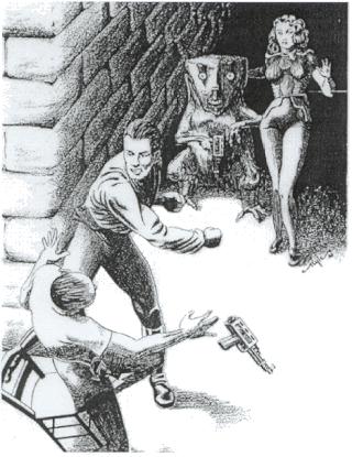
store in Seattle, but that's all I know about it. Then, in the summer of 1999, I
was flabbergasted by an unexpected gift at Pulpcon in Dayton, Ohio, by Robert
Weinberg. It was a full page illustration I didn't recognize it, but it bore my
signature. It was very good. I sort of remembered it. (It's reproduced here.
Perhaps someone will identify where it appeared. I am still in the dark.)
I mentioned in an earlier article
that I had unsuccessfully attempted a magazine illustration for my "Golden Nemesis"
story for the 1936 Wonder Stories {{
ed. note: see "A Hugo Gernsback Author" in Mimosa 7 }} but it was not
until the 1940s that my work was good enough for publication. Fortunately I have
most of my original drawings. Of those I don't, one was reported to be in a book
store in Seattle, but that's all I know about it. Then, in the summer of 1999, I
was flabbergasted by an unexpected gift at Pulpcon in Dayton, Ohio, by Robert
Weinberg. It was a full page illustration I didn't recognize it, but it bore my
signature. It was very good. I sort of remembered it. (It's reproduced here.
Perhaps someone will identify where it appeared. I am still in the dark.)
My favorite illustrations are "Blue
Moon," mostly for the Flash Gordon look-alike trying to evade the sharp teeth of a
crocodile, and "The Martians Are Coming," because I've caricatured both me and Dick
Wilson in the TV screen and showing the masthead of the newspaper I worked on. I
put the "Martians" illustration in my Pictorial History of Science Fiction
(Hamlyn, 1976), but another favorite, "Time Capsule" for the story by Ralph Milne
Farley, was inadvertently left out of my Illustrated Book of Science Fiction
Ideas and Dreams (Hamlyn, 1977).
As the 1950s began I was back in New
York City in my own apartment on the West Side. I was now fully occupied with two
time-consuming facets of my life: I was running Gnome Press with Marty Greenberg
(the fan, not Martin Harry Greenberg the academician) and I was heavily pursuing my
Bachelor's degree at Columbia University. For Gnome Press I did the editorial
writing and editing and acted as production manager and art director. Marty was the
business manager and story consultant.
When the first books were printed in
my family printing shop in Monticello, I had little practical experience but a lot
of enthusiasm and energy. Courses at Columbia University helped immensely in
steering me along the way. Using my artistic talent and training, I designed the
original colophon or special identifying design for Gnome Press -- a gnome sitting
under a toadstool reading a book, inspired by the design used by my father for
Merriewold, a mountain residential park. The early books were designed by me and
the quality was kept very high. I believe that the little touches which cost a bit
more, such as my little symbol embossed in the cover of Asimov's I, Robot,
the chain design for the title page of Heinlein's Sixth Column, and the split
binding and special embossed rocketship on anthologies, made Gnome books
distinctive.
I designed and wrote all the copy for
the early books, drawing designs when appropriate. Professional book printers were
used, especially Colonial Press in Massachusetts which had an office on 42nd Street
opposite the New York Public Library. I collaborated with Edd Cartier in several
ways, the best being the illustrations for my story of the "Interplanetary Zoo";
this was an interesting project because the full color signature or folio in the
anthology Travelers of Space was actually done from black-and-white drawings.
All color was laid in by a talented printing plant technician who worked with me for
the final results. He had done similar work for Lloyd A. Eshbach in the production
of some of Lloyd's Fantasy Press books.
 I did something similar in color work
for Gnome when I worked with Challenge Printing Company printers in New York City
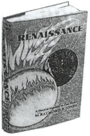
for the printing of the dust jacket for Raymond F. Jones' Renaissance. I
made separate drawings or overlays in black for each of four colors. Then, as each
color was printed as visualized by me, the final jacket took shape. What the
finished product would look like was only in my head -- only as the colors went on
did the design begin to materialize. Voila! Four colors without the expense of
color separation.
I did something similar in color work
for Gnome when I worked with Challenge Printing Company printers in New York City
for the printing of the dust jacket for Raymond F. Jones' Renaissance. I
made separate drawings or overlays in black for each of four colors. Then, as each
color was printed as visualized by me, the final jacket took shape. What the
finished product would look like was only in my head -- only as the colors went on
did the design begin to materialize. Voila! Four colors without the expense of
color separation.
I did the same thing for Gnome's L.
Ron Hubbard book, Typewriter in the Sky and Fear -- I drew separate plates
for each color. It was not as complicated as Renaissance and I had a better
control over the end result. That jacket is one of my favorites, but some colors in
the spine after exposure to years of light have faded badly. I used the same
innovative process for the Conan books -- the crown for Conan had some intricate
color work to highlight the jeweled head piece. These were some of the ways I cut
expenses for Gnome publications, for dust jackets with color separation technology
were extremely expensive yet absolutely necessary to make a book attractive and
saleable. After all, it wasn't easy even in the 1950s to be able to sell a hard
cover book of high quality for only two dollars and fifty cents!
Of all the books published by Gnome
Press, the Conan books are specially noteworthy from an art design viewpoint. I
drew a special end paper which was attached to the inside of the cover and the first
page. This was a map of The Hyborean Age, which depicted the geographical world of
Conan overlaid on the map of Europe and North Africa. I worked from an original
drawing which Robert E. Howard himself had made. I still have my original. The
worthiness of it is attested to by the countless number of times it has been
reproduced in many editions. I'm proud of that. Not so nice, however, is the way it
was treated -- my name was removed, no doubt to avoid any idea of payment to me.
And some of the ornamentation was either removed or reworked in an inferior fashion.
Ethics and courtesy so often is submerged by the crass world of money and
unaesthetic publishing.
My book designs and jackets were hard
work but fun to do and compare favorably with all books and jackets of that time.
My black-and-white drawing for Isaac's Foundation was a very large piece of art,
attempting to capture the sweep of his epic tale. The color plates were made
celluloid overlays for each color. The result was not the best, but I was
experimenting at the time with different techniques in an era before our high tech
copying machines. I was amazed recently to be offered so much money for the
original drawing and hugely honored to know it will hang among other works in the
collection of an astute sf art collector.
My wife Ruth frequently chides me for
not doing artwork anymore. We go to conventions and she sees the elaborated art
shows. She sees all kinds of arts and crafts for sale in the huckster rooms. Why,
she wonders, don't I participate and contribute and, conceivably, sell my wares.
Indeed, why don't I? I've too many other things to do, I say, but I really know my
talented is limited, scores of artists are better than me, and, quite honestly, I'm
out of practice.
Ruth finally won. Last year, just
days before Lunacon, she convinced me to do some artwork for the huckster table she
had reserved. She loves astronomical scenes. I painted three rather simple ones.
I put them on our table. "Why aren't they in the art show," said a friend. That
Friday afternoon he took me to the administrative table and next thing I knew I was
hanging my paintings in one of the bays. I sold one. Ruth did it. Now I'm
thinking: Should I get serious? Should I do what I've so often thought of doing and
never do? Should I again become 'the poor man's Paul' and do some paintings like I
remember the way Frank R. Paul did them? Not crayons with planes and war tanks.
This time astronomical. This time it's rocketships!
Book cover and "fist fight" illustrations by Dave Kyle
All other illustrations by Julia Morgan-Scott
|